Why quiet interfaces win on ordinary Tuesdays
The interface that gets applause on launch day is rarely the one people trust six months later. The one that wins is calm.
A new interface is exciting for about ten minutes. After that, what matters is whether it gets out of the way. Can a tired person on a slow network still finish the form? Can the report they need be one click away, every time? Does the system explain itself the same way on the first and the hundredth use?
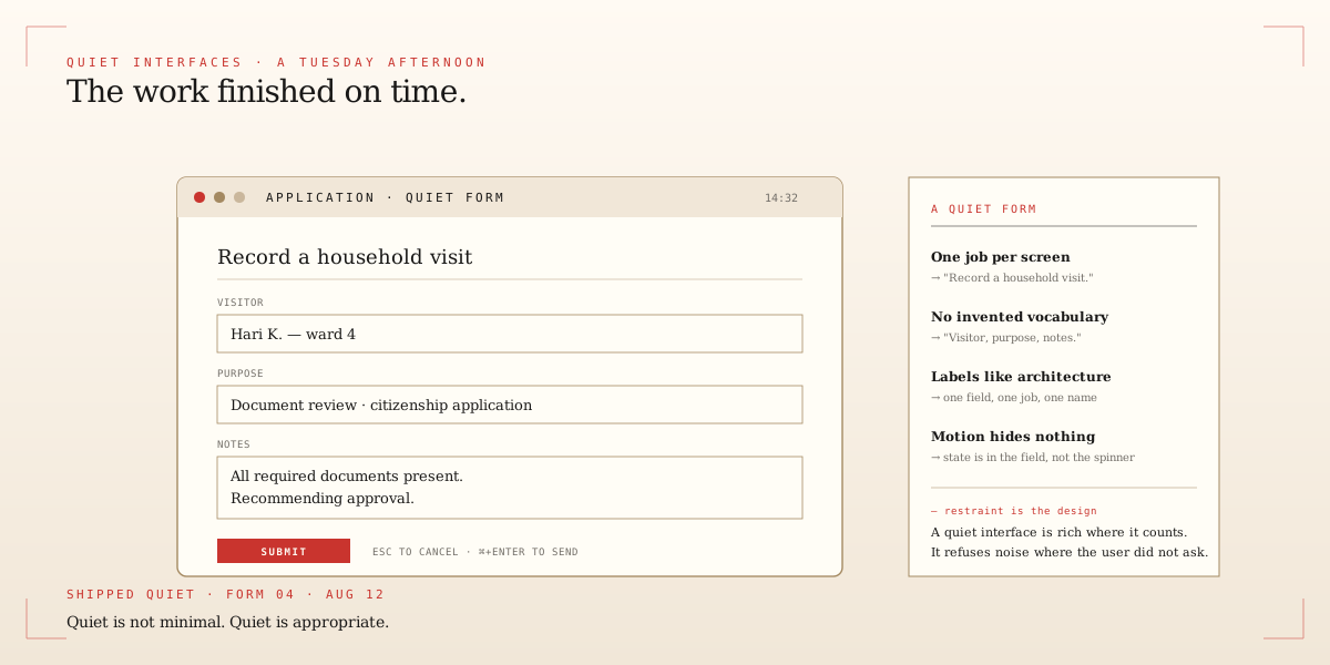
The interfaces I keep returning to have a few things in common. They have one job per screen. They do not invent vocabulary. They treat labels like load-bearing architecture. They never use motion to hide a missing state — they say the state out loud instead.
This is not the same as minimal. A quiet interface can still be rich. It just refuses to make noise where the user did not ask for it. That restraint is what makes a tool feel like it has always been there.